Q&A with book designer, Amy Daoud
The gorgeous and talented Amy Daoud
Isn’t she wonderful?
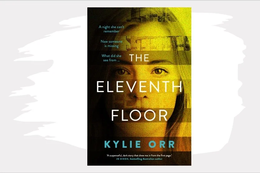
Some things you may not have noticed on the cover upon first view (because I didn’t!):
there are eleven strips
the strip near the forehead is pixelated (foggy memories!)
the strip across the woman’s mouth is dark, as though it is zipped closed
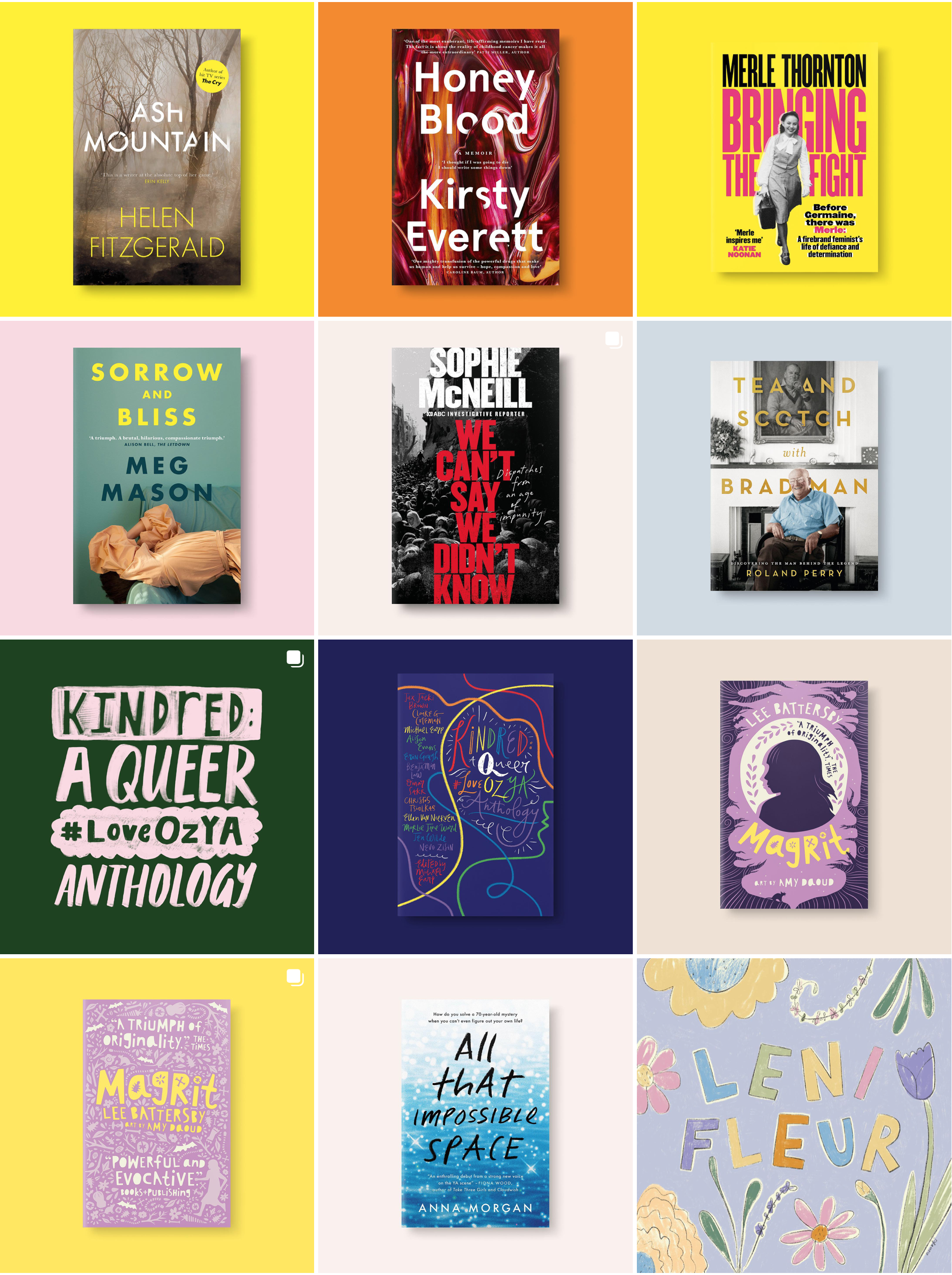
I was thrilled that I scored one of the best book designers around in Amy Daoud. I mean she has designed some iconic covers! I’ve taken a snapshot, but check out her website for more beauties.
From Amy’s Instagram page
Amy kindly offered to answer some of my burning questions about how she approached the design of my book.
Q. I love the subtlety of the eleven strips to match with The Eleventh Floor title. It gives nuance and depth. How did you come up with that?
I always look to a book title when originating initial cover ideas, and something like The Eleventh Floor is a fun place to start as there are so many ways to visually convey “eleven”. In this instance, I knew I wanted to include multiple images on the cover and the horizontal strips, inspired by levels of a hotel building, would grant me the space to do so in a unique and graphic way.
Q. What were some of the challenges with this story in terms of representing it visually?
It was important to depict the book’s setting, mystery and a sense of the main character’s story without being too prescriptive or ending up with a visually-overloaded cover. Having the horizontal strips allowed these different layers to come through as each strip could be treated differently while offering a little detail about the book. It was also important, and a bit tricky, finding an image of our protagonist as the perfect facial expression was paramount.
Q. What do you think will grab a reader the most?
I think the image of our main character is quite compelling. The fact that she is looking directly at the reader while enmeshed in other visuals makes the cover intriguing and, hopefully, pickupable! Yellow was also a deliberate colour choice as a way to help the cover sing on the shelves.
Q. What was the most important message you wanted the cover to convey?
I definitely hope the cover says: mystery, suspense, tension and intrigue.
I think she nailed it. What do you think?
KOx